20 Years of Yu-Gi-Oh! OCG
Today, 4 February 2019, marks the 20th Anniversary of the Yu-Gi-Oh! Official Card Game.
The Yu-Gi-Oh! OCG begun in 4 February 1999 with the launch of the Vol.1 booster pack.
In this article, we will go over the history of the OCG card layout design and the changes over the years.
1999 – 2000: Series 1

Series 1 started with Vol.1 on 4 February 1999.
The most prominent feature of the Series 1 card layout is the card effect text box and Attack/Defense text box having equal size sharing the bottom portion of the card.
The wordings for Attack and Defense are written in full – “攻撃力” and “守備力”.
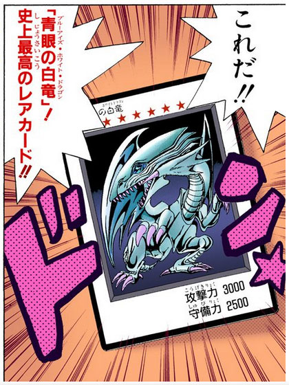
This design is heavily based on the original card layout designed by Takahashi Kazuki in the original Yu-Gi-Oh! manga.
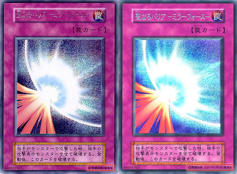
During this period, the Yu-Gi-Oh! OCG was so popular that booster packs were sold out everywhere in Japan. To meet with the growing demands, Vol.4 to Vol.7 had a second print run.
On the left is a first print run of Mirror Force. The bottom-right corner says “©高橋和希/集英社” (©Takahashi Kazuki/Shueisha).
On the right is a second print run of Mirror Force. The bottom-right corner says “©高橋和希 スタジオ・ダイス/集英社” (©Takahashi Kazuki, Studio Dice/Shueisha).
Studio Dice is the company formed by Takahashi Kazuki to manage the Yu-Gi-Oh! franchise.

On 18 August 2018, the 20th Anniversary Set came with a reprint of Vol.1 booster packs.
Although this reprint retained the original Series 1 text box layout, the copyright line is updated with Studio Dice and the Eye of Anubis hologram is added.
2000 – 2002: Series 2
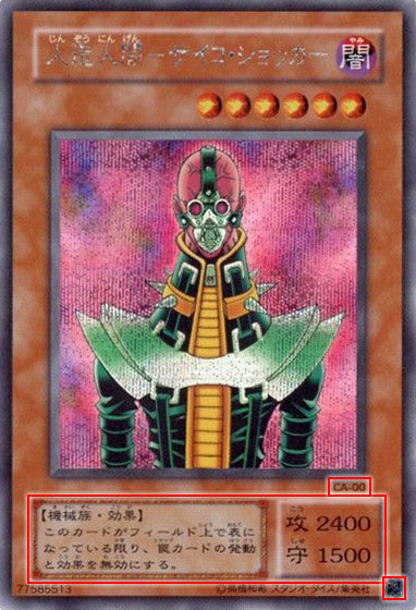
Series 2 started with Magic Ruler on 20 April 2000. The card effect text box is widen to fit longer Monster Effect, by shrinking the Attack/Defense text box. Attack and Defense is shortened to just “攻” and “守” respectively.
The set code and card number is added to the bottom-right corner of the card image as a quick way for players and collectors to identify which set the cards are from.
The set code is represented by 2 letters for each set:
MR = Magic Ruler
PS = Pharaoh’s Servant
CA = Curse of Anubis
The Eye of Anubis hologram is added to the bottom-right corner of the card to distinguish against counterfeit cards.
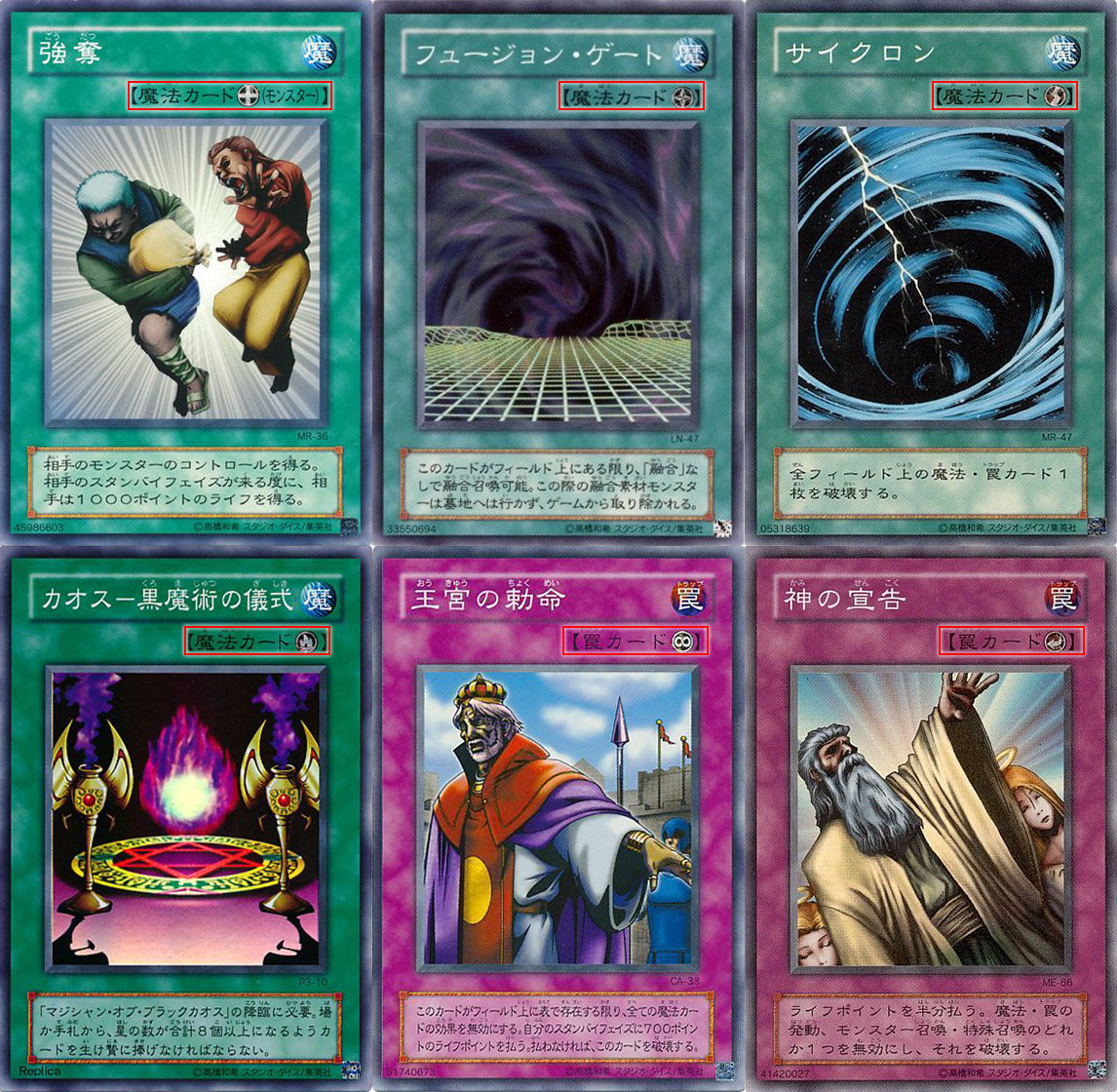
6 new icons are introduced for Spell/Trap cards to make it easier to recognise Equip, Field, Quick-Play, Ritual, Continuous and Counter.
2002 – 2004: Series 3

Series 3 started with The New Ruler on 16 May 2002.
The new design has a singular text box for the card effect and Attack/Defense. The text box is lengthened to fit even longer Monster Effect. The Attack and Defense is now represented by “ATK” and “DEF” in a single line. A horizontal line separates the card effect and Attack/Defense text.
The bigger text box caused the card image to be smaller and slightly shifted upwards. The Level stars are more compact between the card name and the card image.
This design is pioneered by the TCG with the release of Legend of Blue Eyes White Dragon on 8 March 2002. Known as the “World Unified Format”, this design sets the standard for all Yu-Gi-Oh! cards across all languages.
The set code is changed to a 3 digit coding that correspond with the series and set order:
301 = The New Ruler
302 = Advent of Union
303 = Champion of Black Magic
2004 – 2006: Series 4

Series 4 started with Soul of the Duelist on 27 May 2004.
The set code is changed to a 3 letter coding:
SOD = Soul of the Duelist
RDS = Rise of Destiny
FET = Flaming Eternity
A “JP” prefix was added before the card number to signify that it is a Japanese card. This prefix is already in use on TCG cards of various languages.
Yu-Gi-Oh! GX started airing on 6 October 2004 and Elemental HEROes were introduced in The Lost Millennium.
2006 – 2008: Series 5

Series 5 started with Starter Deck 2006 on 23 March 2006.
The set code is changed to a 4 letter coding:
POTD = Power of the Duelist
CDIP = Cyberdark Impact
STON = Strike of Neos
2008 – 2010: Series 6
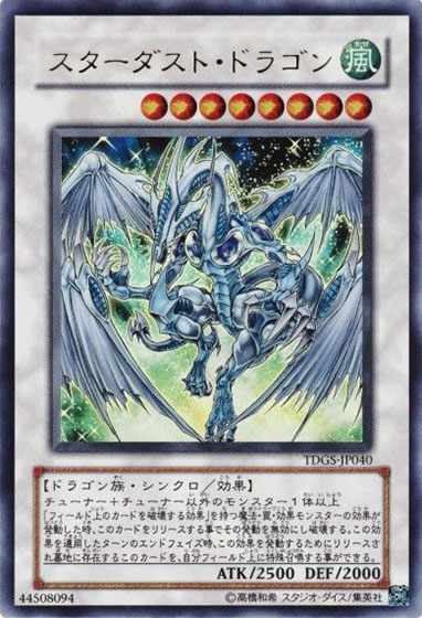
Series 6 started with Starter Deck 2008 on 15 March 2008.
Yu-Gi-Oh! 5D’s started airing on 2 April 2008.
The debut of Synchro Monsters introduced a white frame to the card layout.
2010 – 2012: Series 7
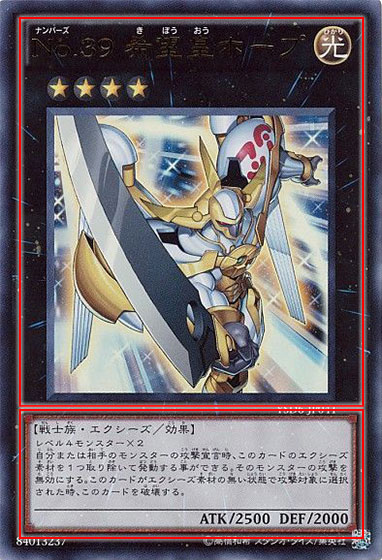
Series 7 started with Starter Deck 2010 on 20 March 2010.
The card effect text box is widen and lengthen again, causing the card image, Level/Rank stars and the card name to shift upwards.
The background color of the card effect text box is brightened, giving it a stronger contrast against the text.
Yu-Gi-Oh! ZEXAL started airing on 18 December 2010.
The debut of Xyz Monsters introduced a black frame to the card layout.
2012 – 2014: Series 8

Series 8 started with Starter Deck 2012 on 17 March 2012.
The card image is enlarged with a narrower border.
The Level/Rank stars are slightly larger and their placement is slightly shifted upwards.
The space between the card name and the card image is now minimized, as the Level/Rank stars are now touching the bottom of the card name and the top of the card image.
The card effect text uses a variable font size. Shorter card effects use a larger font, while longer card effects use a smaller font.
2014 – 2017: Series 9
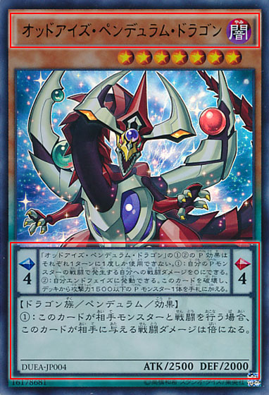
Series 9 started with Starter Deck 2014 on 21 March 2014.
Yu-Gi-Oh! ARC-V started airing on 6 April 2014.
The debut of Pendulum Monsters introduced the yellow/green and brown/green card frame to the card layout, the Pendulum Effect text box and Pendulum Scales.
The card effect text box is widen to accommodate the Pendulum Scales.
The card name text box is shortened, causing the card name and Attribute icon to be slightly smaller too.
The card effect text switched back to having a fixed font size from Duelist Entry Deck VS onwards.
2017 – 2019 (ongoing): Series 10

Series 10 started with Starter Deck 2017 on 25 March 2017.
Yu-Gi-Oh! VRAINS started airing on 10 May 2017.
The debut of Link Monsters introduced the dark blue card frame and Link Arrows to the card layout.
The card name text box is changed from soft curved edges to sharp beveled edges.
Epilogue
Over the 20 years, Yu-Gi-Oh! OCG cards are getting longer and more complicated effects, causing the card layout to evolve to accommodate it.
Although the card effect text box keeps expanding, the card image did not continue to shrink. It is incredible how the design of the card layout maintains the huge card image so everyone can enjoy the amazing artwork of their favourite cards.
Looking through your collection of cards and seeing the changes in the card layout, does it not feel as if you took a walk down the history of Yu-Gi-Oh! OCG?

Im literally shaking and crying right now. I went through so much with this game, it’s like the only good friend i had throughout my life
Great work man!
Wow! This is extremely helpful and a great look down memory lain. Any plans to update this for Series 11 and onward?